日本語の字体 Japanese Letterforms
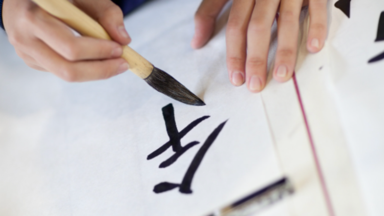
毎週木曜日のニュースレターは、字の書き方についてです。今日は、日本語の勉強を始めて最初に文字を書こうとする時の注意点を、一つお伝えします。
みなさんが目にする日本語の字体には何種類かあると思いますが、ウェブや書籍で最もよく使われている字体は「ゴシック体」です。今このニュースレターも「ゴシック体」で書かれています。
「ゴシック体」が最もよく使われている理由は
- 線の太さが均一
- 形がシンプル
であるため、読みやすいからです。
日本語学習者にとっては入門としてとてもいい字体です。
しかし単純化されているため、本来の手書きの字体からは少し違ってしまっています。
この字体をそのまま手書きすると、日本人から見て、とても不自然な字の形になってしまいます。そしてゴシック体の日本語をそのまま書いてしまっている学習者がとても多い。
もし日本語を日本語らしく書きたいと思うなら、ゴシック体のコピーはしないほうがいいです。ではどのフォントがいいのか?
次回、来週木曜日はどのフォントを学習したらいいのかお伝えします。お楽しみに!
いろは
Every Thursday, the newsletter turns to handwriting. Today, one important thing to know before you write your very first Japanese character.
When you look at Japanese text — online, in books, in newsletters like this one — the typeface you'll most often encounter is called Gothic (ゴシック体, Gothic-tai). This very newsletter is written in Gothic.
Gothic is everywhere for good reason:
- The strokes are uniform in thickness
- The forms are clean and simple
This makes it highly readable, and for anyone just beginning to learn Japanese, it's a wonderfully clear introduction to the characters.
But here's the thing: because Gothic is simplified for readability, it has moved some distance from the way Japanese characters are actually written by hand. If you copy Gothic directly as your handwriting model, the result will look quite unnatural to Japanese eyes. And many learners do exactly this — often without realising it.
If you want your handwriting to look genuinely Japanese, try not to copy Gothic.
So which typeface should you use as your model?
I'll tell you next Thursday. Something to look forward to.
Iroha