【漢字】人べん Kanji Radical: Ninben
【木曜:漢字・書き方】
先週の部首ランキングはご覧になりましたか?
最も良く使われる部首10個のうち、一番めは「氵(さんずい)」でしたが、2番目は「人べん」です。
人べんとは、「休」「体」「作」「住」などの漢字の左側の部分で、「人」という字が変形したものです。人に関係する字によく使われています。
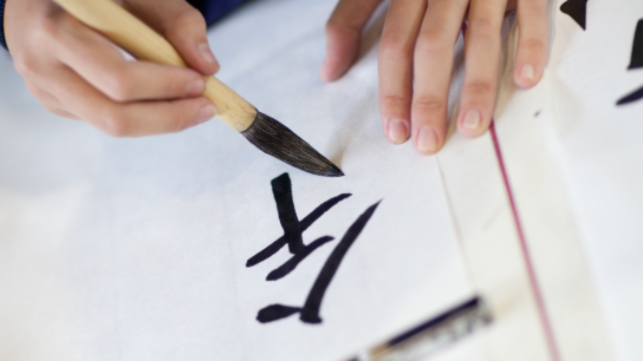
「人」という漢字は、このニュースレターのようなゴシック体で見ると、てっぺんから2本の線が左右に降りているように見えますが、本来は右の線は左の線の真ん中あたりから右下へ降りていくのが「人」という漢字です。(画像参照)
ですので、「人べん」も左の線が上、右の線がその真ん中あたりから下へまっすぐ降りた形になっています。
ゴシック体の漢字をそのまま写さないように、ぜひ意識してみてください。
いろは
Thursday — The Art of Writing
Did you catch last week’s radical ranking?
Of the ten most frequently used radicals in everyday Japanese, the first was 氵 (sanzui, water). The second is 亻— ninben, the person radical.
Ninben is the component you see on the left side of characters such as 休 (rest), 体 (body), 作 (make), and 住 (live). It is a simplified, compressed form of 人 (person), and it appears in kanji connected to people and human activity.
Now, if you look at the character 人 as it appears in a sans-serif font — like the one used in this newsletter — it can look as though two lines simply descend from a central point, one to the left and one to the right. But that is not quite right.
In the true form of 人, the left stroke comes down first, and the right stroke begins partway down that left stroke — not at the top — before continuing down and to the right. (See the image above.)
The same applies to ninben: the left stroke sits higher, and the right stroke begins from around its midpoint and descends straight down.
This is one of the reasons I keep saying: try not to copy directly from sans-serif fonts. The shapes they show are not always the shapes you should be writing.
Iroha